Why We Changed Our Accounts View
Why We Changed Our Accounts View
The newest addition to Wallet that we’re all excited about is the transformation of the old dashboard. Now, Wallet brings your finances to you in two sections--the Wallet Now section, the information centre of your finances, and the Accounts section, the control centre of your finances. This new view is not just cleaner and clutter-free design-wise, it is a major improvement over in terms of functionality as well. Although we explained to you what all Wallet Now brings to you, we decided to elaborate a bit on what triggered this decision to have two separate views for your finances. So here’s why we changed the way your dashboard looks on Wallet:
To make it more simple
Your accounts are now all on one single screen. Every crucial bit of information about your individual accounts is just a single tap away. And, nowit’s much easier to switch between accounts. No more swiping between them. A few of you have told us that you’re having trouble in selecting accounts at times. And, that’s because the new Accounts overview is touch-sensitive. Small, short taps on the account name will bring to you data from that respective account. But a long press means something else altogether. This brings us to the next point. 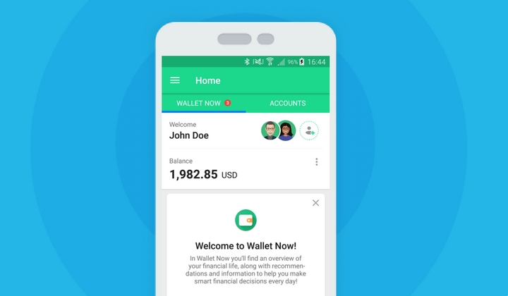
To make it more functional
If you long press on an account name, you enable the newest feature on Wallet--multi-selection of accounts.
For the first time ever, users can get to see information about their finances from more than one account at once on a single screen. Want to see all your transactions from three different credit card accounts? Or want to quickly see how the total balance between yours and your partner’s account looks this week? No swiping back and forth, no filters, nothing. Just one long press is all it takes now.
To make it more focused
The third reason that led us to this change in dashboard design is to remove clutter and group the most crucial information together. Earlier, on the dashboard, you could see a lot many things that weren’t directly connected to your accounts. For instance, your notifications, Goals, Budgets, personal finance tips and so on. We wanted to separate all the news and notifications, and the information about other features that existed on their own and group them under one umbrella. When you looked at your accounts, we wanted to give youa simplified view and make it easy to help you focus on what really matters. All the information that has been moved to Wallet Now are there to help you take quick, informed money decisions on the go. You can get to almost all features of Wallet from this screen. You can add or edit your Goals & Budgets from here. And, even get recommendations and tips on the actions to take on Wallet to stay on track. We’ve already written in detail about every card available on Wallet Now on our blog.
Over to you…
We have built this refreshing new view to simplify your finances and make Wallet clutter-free. But it is still a work in progress. We want to know your feedback and ideas about Wallet Now and the new Accounts view. Leave us your thoughts here. Let’s make Wallet better together!
Note: Wallet Now is currently available on Android devices. It is coming really soon to Wallet for iOS! Follow BudgetBakers on Facebook ,Twitter ,Linkedin and Instagram to get more updates from us.