What started as one man’s dream to develop a tool to manage his finances has now become a full-blown startup, BudgetBakers, employing a motley team of talented individuals, all working towards helping the world lead a richer life.
Who are we, really? Many of us began our journey with BudgetBakers, like you, as users of Wallet. As a team, our users mean the world to us, and we would love for you to take a peek into our life at BudgetBakers. So we present to you an interview series called Meet The Bakers to let you in on a little more about each of us here.
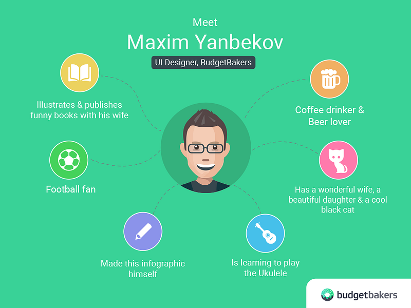
This week, we’ve our UI Designer, Maxim Yanbekov, on the hot seat. Those of you who are iOS and Web App users may have noticed that Wallet now looks fresh and modern on these platforms. And, Max is the man behind this redesign drive. So let’s get an inside view on Max’s process and get to know him a bit better!
Hi Max! Great work on the redesign! Could you tell us what actually triggered the iOS redesign?
I use Wallet for iOS and although it was quite functional, I felt that the design was not optimized for iOS and not really convenient for users. It was basically designed with Android users in mind and there were too many colors and it was too heavy in terms of style. But as a team, we were focused on improving the functionalities of the iOS version first, which is why we put design on the back burner first. When the time was right, I initiated the idea and started working on it.
What was your vision when you set about redesigning the iOS version?
My main concern was to make the design light and clean. The previous design was a bit sticky and cluttered. I wanted it to have a more contemporary, modern feel to it. I wanted it to be more easy on the user’s eye, without distracting them with bright colors and too much text. I also wanted to improve the ease of use, in terms of text sizes, bigger field sizes, font and icons so as to make it easier for users to navigate through the app.
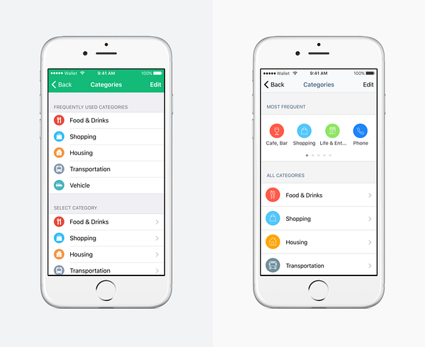
So what are the big changes in the new design?
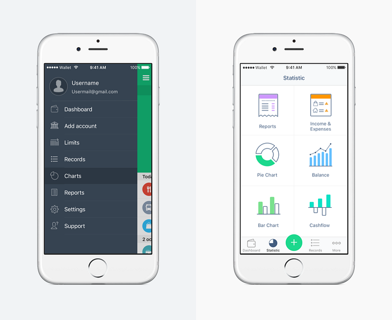
The iOS version is more clean, like I mentioned before, there is more white space and it is much lighter than the old version. The main change is in the Dashboard. Now, it is easier to toggle between different accounts and you can see your all your accounts listed in a more convenient way.
Now, Wallet for iOS has the classic Apple look and feel, which is a huge change from the earlier Android-ish look. So the main menu has been moved to the bottom. There a lot more tiny changes, as in more details added to this version.
For instance, in the list of records, next to the icons, you can see a tiny colored circle. This color of this circle corresponds to that of the account from which the transaction has been made. So, you wouldn’t have to click on the record to see this information. That is, if you have a good memory! (laughs)
The next change is in the analysis tools. We have a sort of dashboard for it now. When you click on the Statistics button in the new bottom menu, it takes you to a grid of all available analytical tools on Wallet.
There are also more convenient filter screens in this new version, with an added Transfer option apart from the existing Income and Expense options.
What is your favorite feature in this redesign?
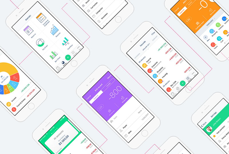
(Laughs) That’s yet to come! Like we have really clean-looking charts and graphs. Then, there is the new Template screen. I love the new screens for adding Bank Accounts. It’s much more clear and interactive. All this will be coming soon. I wanted to give our users an exclusive sneak peek into what awaits them in the upcoming updates. Here’s some eye candy for you:


How long did this redesign process take and can you tell us a bit more about your process?
From idea to deployment, I would say the redesign took a whole month. The whole app or user interface hasn’t changed, only the design has changed, with some much-needed UI improvements. I think in images, so I worked a lot with our UX designer, Nick (Nikolaj Rýfr), to align the visuals with the app’s usability.
I used the graphic design app called Sketch to draw and design. I also created a new Design Library for Wallet. In this redesign, we haven’t used generic Apple icons, blocks, views or buttons. Every graphic element in the app has been designed from scratch exclusively for Wallet. The design went through many iterations. There were countless discussions and debates before this final version was agreed upon.
Great work, indeed! So now, let’s get to know you better Max. When did you join BudgetBakers and tell us a bit about your life before that.
I’m from Russia. So, before joining BudgetBakers, I worked for a Russian information portal as a web designer. I moved to Prague five years ago to do my masters at Plzeň in the Czech Republic. After my course, I did many freelance projects and then moved to Prague. I joined BudgetBakers in July 2016.
What do you like most about Wallet? Your favorite feature?
I’ve felt that Bank Connections is the most valuable feature on Wallet. Especially for those like me who live and work in a different country. I can add, access and track both my Russian and Czech accounts using Wallet. I can also use multiple currencies on Wallet. I don’t like to input my transactions every day, so I’m glad that Wallet automatically does this for me and does away with all the effort in staying on track.
What are you working on right now and what all do you do at BudgetBakers?
Right now, I am working on the finer elements of the iOS redesign, as that is the biggest change that’s happening on BudgetBakers right now. Otherwise, I do all graphic design work for BudgetBakers. This involves all visual design, like web design, Android design, iOS, design for marketing campaigns, email templates, social media graphics, and we all are part-time testers as well! (Laughs)
What do you like the most about working at BudgetBakers?
I like the team. It’s multicultural and fun. I also really like the space we work out of. Of course, not just because it is close to my home, which is like just two minutes away. But it also provides the right ambience for creative work and collaboration.
Tell us something about your life outside BudgetBakers. Family, hobbies…
I live with my wife, my daughter and a cool black cat. My daughter is a fun-loving and active girl. So I spend a lot of time outside of work with her. I like to hang out with my friends, grab a beer! Sometimes, I go out to play football and tennis, if the weather permits. And, I’m currently learning how to play the ukulele.
You are also doing some other interesting work. Could you tell us a bit about it?
Yes, my wife and I draw and publish funny Czech-Russian dictionaries. We’ve been doing this for a while and love working on it. You can take a look at them and my portfolio at my website.
Follow Max’s work on Facebook, LinkedIn or Instagram.
You can read more about us on the Team page on our website. Follow BudgetBakers on Facebook, Twitter, LinkedIn and Instagram to get more updates on our team.